Hello all.
The past few months have been exceptionally difficult and I am only now beginning to get some degree of normality back.
Given the abuse this blog has seen since my last login, it makes me think if a blog is the way forward. I have had it with the scammers, links posted that have nothing to do with what you or I am talking about, and if some better means is open to me to keep going.
Would a forum be better, what do you think?
Where this goes is in your hands and I will take all the advice I receive and look into the most popular suggestion.
Regarding what to put in the new means, what would you like to see?
Perhaps:
A weekly round up
What to look for in the coming week
A list of the most common traded instruments broken down as above?
A dedicated topic for each pair or instrument to allow folks give their views?
A more general topic for those seeking help.
Above all, I have to get rid of the abusive nature of folks on the Internet who hinder creative thought and take time away from the intended purpose.
I look forward to reading your thoughts!
An addition to this post is moderation to all comments to help get rid of the scammers and con artists is now in place. All genuine comments will be let through and the others binned and I hope a ban would also work, if I can find a way to do that.
I will update this post again later in the coming week so that you know whats going on. In the mean time I will post up a new chart and walk you through it.
Thursday, 16 August 2018

Thursday, 7 September 2017
eur/usd Sept 7 2017 update
Ok time for an update on the last eur/usd post. Lets see how it has developed and if the pair are playing out with the same long bias as before.
First chart is the monthly.

Looking at the right hand edge of the chart I can noted three candles. 1 is a push through of the top of the established range, 2 is not an uncommon candle and appears to be indecision, but it does close above the previous candle which is bullish. 3 is still forming and far too early to call. Above and left of price is where pro money shorted the pair back in May 2014. While all this may seem to be light years away, these price areas are clearly of interest to pro money and its best to be highly tuned to what takes place in them when price gets into them in the future. There are several types of pro money folks and it is the investor type who will become involved in this areas and hold for long periods of time and take the long term view. The daily price moves below the daily are nothing but noise to these people.
Far too many day traders also look and place too much decision making on time frames below 4hr. That is the ideal way to go broke.
Weekly chart.

Upper left is pro money shorting the market and the nice fall away to their target area. The bottom of a price range formed here and has had three tests of its lows and the most recent test will look like a bearish break out to day traders. Again, another nice way to go broke. The higher time frames is where you see the best clarity.
The blue line is the upper portion of the range and we have broken through and seen a failed test of the top of the range, only for that test to itself be false. The dip inside the range will again look like a bearish trip to the bottom of the range and many day traders get taken out. Price did close outside of the top of the range after and a strong move higher following that false bearish week.
FB is just short hand for false break, I try not to shorten words where possible and keep a chart clear and make it easier to see and read. The second last candle breaks the strong bullish candle and will have gotten day traders long as they will have seen continuation. It turned against them as I would have expected to take out stops, get shorts in the market and in turn, have them taken out again once the new price direction continues.
You should start seeing how pro money will milk the market of every chance it gets to get cheap orders in the market, by taking yours. This happens every day and will continue to do so as long as folks dont wait for established areas to be used again by pro money to load up.
An accurate old saying still holds true, buy low and sell high.
Daily chart

Blue line shows the old high price of the upper portion of the established price range. We have now seen price break through it and come back to test this upper range. There are a few tails on candles showing price pushes into the range where some day traders on low time frames will have been duped.
On the upper most candle we see a low close and selling came back into the market. The function of that candle was many, it tested how much selling would happen, it got day traders short, it brought price back into the origin of the bullish move up, and it stopped out day trader shorts, filled new pro money longs at the best price at the time.
At the current candle price we see it push into the area of where the FB candle topped out. If no major short reaction takes place, then price wont have much effort in making higher prices.
4hr chart.

A little closer in on the action here, and we can see the push higher and notice one interesting fact. The price action shown is not major selling. It has been more orderly and controlled. The price ends up at the origin and and reacts nicely, not a bear to the seen!
Soon after a nice upward thrusting candle pins the most recent sell off and takes out most of the short orders there and allows price rise with no major selling coming in. This is good news for the bulls.
1hr chart.

Lower blue indicates the upper price range tested and held. A large bullish candle spikes short term supply and assists price in getting back into the lower range of the candles that have risen from the upper price range test. The sellers will now have lesser ability to push price lower and some positioning has to be done by pro money to feed in orders where they can and where it wont be seen for an extended period of time. This is what sets up in where the choppy price action follows for some time. The lack of supply is the most helpful guide we have here.
Lastly, the last few candles show strong price movement upward and a close above the spike with little reaction short. This can only be good for higher prices.
The most obvious target will be the prices left of the chart could lead us into the close of the market this coming Friday.
First chart is the monthly.

Looking at the right hand edge of the chart I can noted three candles. 1 is a push through of the top of the established range, 2 is not an uncommon candle and appears to be indecision, but it does close above the previous candle which is bullish. 3 is still forming and far too early to call. Above and left of price is where pro money shorted the pair back in May 2014. While all this may seem to be light years away, these price areas are clearly of interest to pro money and its best to be highly tuned to what takes place in them when price gets into them in the future. There are several types of pro money folks and it is the investor type who will become involved in this areas and hold for long periods of time and take the long term view. The daily price moves below the daily are nothing but noise to these people.
Far too many day traders also look and place too much decision making on time frames below 4hr. That is the ideal way to go broke.
Weekly chart.

Upper left is pro money shorting the market and the nice fall away to their target area. The bottom of a price range formed here and has had three tests of its lows and the most recent test will look like a bearish break out to day traders. Again, another nice way to go broke. The higher time frames is where you see the best clarity.
The blue line is the upper portion of the range and we have broken through and seen a failed test of the top of the range, only for that test to itself be false. The dip inside the range will again look like a bearish trip to the bottom of the range and many day traders get taken out. Price did close outside of the top of the range after and a strong move higher following that false bearish week.
FB is just short hand for false break, I try not to shorten words where possible and keep a chart clear and make it easier to see and read. The second last candle breaks the strong bullish candle and will have gotten day traders long as they will have seen continuation. It turned against them as I would have expected to take out stops, get shorts in the market and in turn, have them taken out again once the new price direction continues.
You should start seeing how pro money will milk the market of every chance it gets to get cheap orders in the market, by taking yours. This happens every day and will continue to do so as long as folks dont wait for established areas to be used again by pro money to load up.
An accurate old saying still holds true, buy low and sell high.
Daily chart

Blue line shows the old high price of the upper portion of the established price range. We have now seen price break through it and come back to test this upper range. There are a few tails on candles showing price pushes into the range where some day traders on low time frames will have been duped.
On the upper most candle we see a low close and selling came back into the market. The function of that candle was many, it tested how much selling would happen, it got day traders short, it brought price back into the origin of the bullish move up, and it stopped out day trader shorts, filled new pro money longs at the best price at the time.
At the current candle price we see it push into the area of where the FB candle topped out. If no major short reaction takes place, then price wont have much effort in making higher prices.
4hr chart.

A little closer in on the action here, and we can see the push higher and notice one interesting fact. The price action shown is not major selling. It has been more orderly and controlled. The price ends up at the origin and and reacts nicely, not a bear to the seen!
Soon after a nice upward thrusting candle pins the most recent sell off and takes out most of the short orders there and allows price rise with no major selling coming in. This is good news for the bulls.
1hr chart.

Lower blue indicates the upper price range tested and held. A large bullish candle spikes short term supply and assists price in getting back into the lower range of the candles that have risen from the upper price range test. The sellers will now have lesser ability to push price lower and some positioning has to be done by pro money to feed in orders where they can and where it wont be seen for an extended period of time. This is what sets up in where the choppy price action follows for some time. The lack of supply is the most helpful guide we have here.
Lastly, the last few candles show strong price movement upward and a close above the spike with little reaction short. This can only be good for higher prices.
The most obvious target will be the prices left of the chart could lead us into the close of the market this coming Friday.
Wednesday, 26 July 2017
Eur/Usd
After much delay I am finally getting back to putting some posts here for you all. Lets get stuck in and get back to the Euro/Usd and see how it is looking.
First up is the ten mile high view based on the monthly chart and get a wide look back through price history and see what stands out.

A price chart never lies or will spin you some story you hear from vested interest folks. Always look at what is obvious and clear. What is obvious here is price rose from the lower left to a high in the middle of the chart, then price fell sharply, recovered and fell sharply again. The next rise in price was laboured and so was its subsequent fall. Looking at the low part of each of the three attempts to rise shows us something interesting on the final attempt to rise. The time taken to rise was longer than all the previous attempts following the main fall in price from the middle of the chart, and we only from this last painfully slow rise do we see a clean, clear and obvious fall in price where no bullish activity of note took place.
At the end of that fall in price we see a narrow range relative to this time frame as been established and only now is price approaching the top of this range. The blue line indicates the upper part of the range and an area we as day traders need to start paying attention.
Next time frame, the weekly.

More intel comes to us, the blue line clearly shows the top of the range established on the monthly chart. Ignore the tiny red candle, it is only forming and not yet completed its journey through time. Its reaction so far gives us more information and as we drop down through other time frames we will get more and more intel to work from.
I have placed a tick mark showing an area of interest that will be on our radar if we see price break the established range and later test it, we want to be aware of areas of price support and profit targets well ahead of time. We now can see where price should get support if the range is going to be broken and tested, and we also see where a likely price area for profit around 500 points north.
Now we move to the daily time frame.

A short description but a telling one. The blue line is the top of our discovered price range and price has bounced off it and fallen back. We can say with full conviction that the range has not been broken. Ah, but the eagled eyed of you will say, hold on a second. What is the yellow line, this line is a second price area just below the high of the range denoted by the blue line. I drew in the yellow line to attract your eye to something worthy of note. The more nearer term high from the yellow line could be a good place for price to gain support from buyers who could send it with enough force up through the higher up blue line. It will be less of an effort for price to rise if this happens. Less effort means less cost and less cost means more profit, and more profit means pro money is happier to take the trade higher and break the range. But, we wait and see and keep an eye on how price reacts.
As the time frames go lower we see more and more of the methods of pro money.
Next we look at the 4hr time frame.

Between the two lines there is around 90 points. The second last candle shows how price pinned the lower end of this smaller range and closed higher up on the candle body and only a moderate amount of selling coming in. The way in which the selling came in wont be seen until we drop lower down in time. So lets move on.
1hr time frame.

An even clearer picture of price hitting the lower end of the price range with a bearish candle closing with buyers coming in, and the following candle closing bullish and the 3rd last candle closing with some sellers coming in, but not enough to push price back down given the later candles all closing with activity at their upper ends. So far, no major selling coming in. But look at the huge effort by pro money to push price higher in the box, that was a serious effort and not one that will fail without a fight. The fight of choice is now apparent, it is to tire out and try false breaks to gain enough orders enabling pro money to push again. This is not yet proven, and we need to wait, bit so far everything they are doing is bullish.
Lets drop down again.
30 min time frame.

Final chart given we are in a trading range. Price has risen toward the right edge and is in a holding mode. No major selling, no major buying and someone will have to give soon. Perhaps coming into the London close will see a retest of the lows or maybe a false bearish break, we simply dont know yet and must exercise patience and trade what we see. Some news driven even may be enough to bust price out and then we watch for a test where the loosing side gives up and the pro's take it from there.
First up is the ten mile high view based on the monthly chart and get a wide look back through price history and see what stands out.

A price chart never lies or will spin you some story you hear from vested interest folks. Always look at what is obvious and clear. What is obvious here is price rose from the lower left to a high in the middle of the chart, then price fell sharply, recovered and fell sharply again. The next rise in price was laboured and so was its subsequent fall. Looking at the low part of each of the three attempts to rise shows us something interesting on the final attempt to rise. The time taken to rise was longer than all the previous attempts following the main fall in price from the middle of the chart, and we only from this last painfully slow rise do we see a clean, clear and obvious fall in price where no bullish activity of note took place.
At the end of that fall in price we see a narrow range relative to this time frame as been established and only now is price approaching the top of this range. The blue line indicates the upper part of the range and an area we as day traders need to start paying attention.
Next time frame, the weekly.

More intel comes to us, the blue line clearly shows the top of the range established on the monthly chart. Ignore the tiny red candle, it is only forming and not yet completed its journey through time. Its reaction so far gives us more information and as we drop down through other time frames we will get more and more intel to work from.
I have placed a tick mark showing an area of interest that will be on our radar if we see price break the established range and later test it, we want to be aware of areas of price support and profit targets well ahead of time. We now can see where price should get support if the range is going to be broken and tested, and we also see where a likely price area for profit around 500 points north.
Now we move to the daily time frame.

A short description but a telling one. The blue line is the top of our discovered price range and price has bounced off it and fallen back. We can say with full conviction that the range has not been broken. Ah, but the eagled eyed of you will say, hold on a second. What is the yellow line, this line is a second price area just below the high of the range denoted by the blue line. I drew in the yellow line to attract your eye to something worthy of note. The more nearer term high from the yellow line could be a good place for price to gain support from buyers who could send it with enough force up through the higher up blue line. It will be less of an effort for price to rise if this happens. Less effort means less cost and less cost means more profit, and more profit means pro money is happier to take the trade higher and break the range. But, we wait and see and keep an eye on how price reacts.
As the time frames go lower we see more and more of the methods of pro money.
Next we look at the 4hr time frame.

Between the two lines there is around 90 points. The second last candle shows how price pinned the lower end of this smaller range and closed higher up on the candle body and only a moderate amount of selling coming in. The way in which the selling came in wont be seen until we drop lower down in time. So lets move on.
1hr time frame.

An even clearer picture of price hitting the lower end of the price range with a bearish candle closing with buyers coming in, and the following candle closing bullish and the 3rd last candle closing with some sellers coming in, but not enough to push price back down given the later candles all closing with activity at their upper ends. So far, no major selling coming in. But look at the huge effort by pro money to push price higher in the box, that was a serious effort and not one that will fail without a fight. The fight of choice is now apparent, it is to tire out and try false breaks to gain enough orders enabling pro money to push again. This is not yet proven, and we need to wait, bit so far everything they are doing is bullish.
Lets drop down again.
30 min time frame.

Final chart given we are in a trading range. Price has risen toward the right edge and is in a holding mode. No major selling, no major buying and someone will have to give soon. Perhaps coming into the London close will see a retest of the lows or maybe a false bearish break, we simply dont know yet and must exercise patience and trade what we see. Some news driven even may be enough to bust price out and then we watch for a test where the loosing side gives up and the pro's take it from there.
Monday, 10 April 2017
extended break
Hello all,
Had a much needed break over Christmas and went on an extended trip to Asia and it is now back to normality once again and hitting the charts.
I will post some charts and thoughts up very soon.
Had a much needed break over Christmas and went on an extended trip to Asia and it is now back to normality once again and hitting the charts.
I will post some charts and thoughts up very soon.
Wednesday, 19 October 2016
Silver walk through
In giving this view of Silver it will be of use for other instruments and reading their charts.
This is the weekly chart of Silver.
The immediate task is to determine if price is in a trend or in a range. What we see was a bearish trend that slowed down, the pulled back up into supply and is now going back in the direction of the original trend. Our bias on this chart on its own is bearish.

Daily chart.
On the left you see a strong move up out of what will look like resistance to day traders and given it lasted a number of days, there will be break out traders, new bullish longs each day and all delighted with their entries. The real danger was in not reading the big picture. The idea was for pro money to get price back into an area where they can filter in more short orders while the herd is in full buy mode. Lots of orders get filled without price moving much against pro money. And that is the ideal place to be. This method has not changed since instruments have been traded. Too many day traders get caught in the moment.
As price made a poor fall away from supply, there was a considerable period of time taken before we eventually reached the most near term demand. But note how the area was pierced deeply. That shows little in the way of bullish support and has setup a small range. Lets dig deeper.

4hr chart.
From this time frame a clearer picture is emerging. We can see price falling and hitting what looks like support. But its support in an unusual place, but never the less we will still call it 'come kind' of support because price did bounce. We also see that the buyers are not there in great numbers based on price action alone. The most recent jump in price where the 2nd last candle shows buying...was no more than pushing price into the supply area. And the very last candle shows sellers stepping in and taking it lower, and from a place where I would expect genuine selling and not herd control by pro money.
There is a range of around 60 points in this and plenty room for the pro's to consider taking it lower. There is nothing to show serious buying and the bias is still bearish.

And finally the 1hr.
This is about the only reasonable attempt I can give on an active market. We clearly see the supply on the top left and reaction to it on the top right. All is behaving normal here and as I type the last candle is near closed and is pushing down to its lows, all good signs of pro selling and the London close is upon me in 10 minutes. Given it is late in the day it wont surprise me to see price go back up with profit taking and the real bearish move happen another day or if the NY session can get back into 1hr supply and then go back down.
There is a small area below current price marked by a red line. I am expecting something to happen here. It is mid range and if we can break it, I hope the horrible price action below it can get taken out and the bottom of the range tested. Ideally in the longer I want to see Silver and Gold fall a good deal further.
It was October 11th when the sellers first showed up and its taken a full week for price to get back there and more selling take place. The time within these two events is when you need to learn to be patient and let price do its thing and work its way into an area where we become interested. You can never force a trade and trying will burn you. Within ranges is also where you do not trade.
The actions of pro money are not complex, they only become active when the price is in their favor and they typical shed orders slowly into mania that the herd react too. Such as break outs that turn out to be false, news events which are complete nonsense and no pro trader ever reacts to them. Little catches pro money off guard.

Pro money filter in their orders where you wont see it until price is moved by them. Eventually their activity is so over whelming that they can no longer get more orders placed, or larger orders get placed by additional traders that creates the move away. If you do touch trades you have the highest reward and also the highest risk, if you wait for price to retrace you get a lower reward and a lower risk, but there is pretty much always some form of a pull back or retrace if you wait for it. Such as what we saw in the Silver chart.
This is the weekly chart of Silver.
The immediate task is to determine if price is in a trend or in a range. What we see was a bearish trend that slowed down, the pulled back up into supply and is now going back in the direction of the original trend. Our bias on this chart on its own is bearish.

Daily chart.
On the left you see a strong move up out of what will look like resistance to day traders and given it lasted a number of days, there will be break out traders, new bullish longs each day and all delighted with their entries. The real danger was in not reading the big picture. The idea was for pro money to get price back into an area where they can filter in more short orders while the herd is in full buy mode. Lots of orders get filled without price moving much against pro money. And that is the ideal place to be. This method has not changed since instruments have been traded. Too many day traders get caught in the moment.
As price made a poor fall away from supply, there was a considerable period of time taken before we eventually reached the most near term demand. But note how the area was pierced deeply. That shows little in the way of bullish support and has setup a small range. Lets dig deeper.

4hr chart.
From this time frame a clearer picture is emerging. We can see price falling and hitting what looks like support. But its support in an unusual place, but never the less we will still call it 'come kind' of support because price did bounce. We also see that the buyers are not there in great numbers based on price action alone. The most recent jump in price where the 2nd last candle shows buying...was no more than pushing price into the supply area. And the very last candle shows sellers stepping in and taking it lower, and from a place where I would expect genuine selling and not herd control by pro money.
There is a range of around 60 points in this and plenty room for the pro's to consider taking it lower. There is nothing to show serious buying and the bias is still bearish.

And finally the 1hr.
This is about the only reasonable attempt I can give on an active market. We clearly see the supply on the top left and reaction to it on the top right. All is behaving normal here and as I type the last candle is near closed and is pushing down to its lows, all good signs of pro selling and the London close is upon me in 10 minutes. Given it is late in the day it wont surprise me to see price go back up with profit taking and the real bearish move happen another day or if the NY session can get back into 1hr supply and then go back down.
There is a small area below current price marked by a red line. I am expecting something to happen here. It is mid range and if we can break it, I hope the horrible price action below it can get taken out and the bottom of the range tested. Ideally in the longer I want to see Silver and Gold fall a good deal further.
It was October 11th when the sellers first showed up and its taken a full week for price to get back there and more selling take place. The time within these two events is when you need to learn to be patient and let price do its thing and work its way into an area where we become interested. You can never force a trade and trying will burn you. Within ranges is also where you do not trade.
The actions of pro money are not complex, they only become active when the price is in their favor and they typical shed orders slowly into mania that the herd react too. Such as break outs that turn out to be false, news events which are complete nonsense and no pro trader ever reacts to them. Little catches pro money off guard.

Pro money filter in their orders where you wont see it until price is moved by them. Eventually their activity is so over whelming that they can no longer get more orders placed, or larger orders get placed by additional traders that creates the move away. If you do touch trades you have the highest reward and also the highest risk, if you wait for price to retrace you get a lower reward and a lower risk, but there is pretty much always some form of a pull back or retrace if you wait for it. Such as what we saw in the Silver chart.
Saturday, 15 October 2016
Last trade of the week
Last trade of the week.
I briefly mentioned this in a previous reply to a comment and here is the last trade taken this past week. It was a eur/usd short and I closed it manually because I was called away prior to the market close and did not want the trades to remain over the weekend if my target did not get hit before the market close.
I decided that the 12 point loss of profit was better to take than giving back the previous 160 points per trade. The price may now bounce close to where I had my target and my expectation is that price will continue lower at some future time from there. But we must wait and see if this is the case.
The bottom of a range wont be much further below the target area and while shorting in that makes sense, be fully aware than major buying did come in earlier this year. Some of those orders and interest will be long gone, but some will appear again and keep your eye on them.

I briefly mentioned this in a previous reply to a comment and here is the last trade taken this past week. It was a eur/usd short and I closed it manually because I was called away prior to the market close and did not want the trades to remain over the weekend if my target did not get hit before the market close.
I decided that the 12 point loss of profit was better to take than giving back the previous 160 points per trade. The price may now bounce close to where I had my target and my expectation is that price will continue lower at some future time from there. But we must wait and see if this is the case.
The bottom of a range wont be much further below the target area and while shorting in that makes sense, be fully aware than major buying did come in earlier this year. Some of those orders and interest will be long gone, but some will appear again and keep your eye on them.

Sunday, 9 October 2016
Long John Silver
With a title such as that, there may be the makings of a new Pirate movie in this post, but alas, it is merely said in jest as it to chase fools Gold listening to what comes out the media mouth pieces.
A little history lesson to show where we were when the media and their pay masters told us to buy. The daily chart shows all the major details we need.
At the top of the chart is the infamous area where the expert in Silver trading told us all to buy because the price was shooting up. At the time I called doo doo on this and history has shown my words to be the most reasonable. Experience teaches us all valuable lessons and this one was in my eyes, a real class and expected message from a trader who was in desperate need of getting him and his fellow traders out of their long positions. Good trading advice neither comes for free or from the media. Buying at high prices goes against what pro money does and should also be against what you do. You only ever buy low and sell high if you can see room for profit, clear targets for stop loss and profit and only after pro money show they are involved.
The initial move up on this time frame has recently been hit by falling prices, but look at the reaction. Price has fallen well into the area where pro money finaly pushed price up out of a range, and now the weekly and daily chart show weakness. The very last candle close of the week shows some selling into the close. We will zoom in closer on this next.

4hr chart.
Looking at the most recent price action there was a strong move down and bought into, but the buying was sustained over a period of time indicating pro money wanted to stop the down move and pull price back up. When price moved back up in reached near term supply on the 3rd last candle. As expected sellers came back into the market in larger numbers. I say sellers with regards to the amount of sell orders.
A reaction to this selling was more buying and we closed near the high of the last candle. We know the main force behind silver is short and the amount of buying gone in needs to be further tested for the presence of selling. If the top of the 4rd last candle is tested and no sellers come in, then price is likely to rise further and potentially into the blue line I have drawn in. This looks like no mans land, but its a major area of interest to pro money if the 3rd last candle is broken.
Pro money needs lots of opposing orders to get the cheapest entry price and make it appear price will continue to rise. None of us know how long it will take for price to climb back up to where enough sell orders have been placed into the market. But using some logical thought, we know the main use for Silver is an industrial metal for plating in electronic etc. Looking at that sector I do not see (and pardon the pun) any silver lining and the main US trade indices do not show much growth or good news there either. So the value in silver is pretty much for the bears at the moment.
The blue line is NOT a fixed price, it is an price area and there will be some wiggle room around it. As price gets into the area where pro money are interested, price will become erratic on lower time frames. That is order flow, plain n simple.

And for some show and tell.........the 30min chart ahead of time.
My blue line at the same price area.....and what do you know, a little price are where price took a double step before falling lower in the past. So you too watch this area if price makes it back. This is part of the price area where I will watch with great interest. The indicator traders out there will see their whizz bang stuff telling them to buy, media pimping silver is on a tear and we on the other hand, sit and wait to see will sellers come in and if they do, we will know where and why. Its better to get to watch a story unfold where you almost can see the outcome before hand.
So now, you watch wait and be patient. The trade will come to you if you let it, and trade what you see and not what you think.

A little history lesson to show where we were when the media and their pay masters told us to buy. The daily chart shows all the major details we need.
At the top of the chart is the infamous area where the expert in Silver trading told us all to buy because the price was shooting up. At the time I called doo doo on this and history has shown my words to be the most reasonable. Experience teaches us all valuable lessons and this one was in my eyes, a real class and expected message from a trader who was in desperate need of getting him and his fellow traders out of their long positions. Good trading advice neither comes for free or from the media. Buying at high prices goes against what pro money does and should also be against what you do. You only ever buy low and sell high if you can see room for profit, clear targets for stop loss and profit and only after pro money show they are involved.
The initial move up on this time frame has recently been hit by falling prices, but look at the reaction. Price has fallen well into the area where pro money finaly pushed price up out of a range, and now the weekly and daily chart show weakness. The very last candle close of the week shows some selling into the close. We will zoom in closer on this next.

4hr chart.
Looking at the most recent price action there was a strong move down and bought into, but the buying was sustained over a period of time indicating pro money wanted to stop the down move and pull price back up. When price moved back up in reached near term supply on the 3rd last candle. As expected sellers came back into the market in larger numbers. I say sellers with regards to the amount of sell orders.
A reaction to this selling was more buying and we closed near the high of the last candle. We know the main force behind silver is short and the amount of buying gone in needs to be further tested for the presence of selling. If the top of the 4rd last candle is tested and no sellers come in, then price is likely to rise further and potentially into the blue line I have drawn in. This looks like no mans land, but its a major area of interest to pro money if the 3rd last candle is broken.
Pro money needs lots of opposing orders to get the cheapest entry price and make it appear price will continue to rise. None of us know how long it will take for price to climb back up to where enough sell orders have been placed into the market. But using some logical thought, we know the main use for Silver is an industrial metal for plating in electronic etc. Looking at that sector I do not see (and pardon the pun) any silver lining and the main US trade indices do not show much growth or good news there either. So the value in silver is pretty much for the bears at the moment.
The blue line is NOT a fixed price, it is an price area and there will be some wiggle room around it. As price gets into the area where pro money are interested, price will become erratic on lower time frames. That is order flow, plain n simple.

And for some show and tell.........the 30min chart ahead of time.
My blue line at the same price area.....and what do you know, a little price are where price took a double step before falling lower in the past. So you too watch this area if price makes it back. This is part of the price area where I will watch with great interest. The indicator traders out there will see their whizz bang stuff telling them to buy, media pimping silver is on a tear and we on the other hand, sit and wait to see will sellers come in and if they do, we will know where and why. Its better to get to watch a story unfold where you almost can see the outcome before hand.
So now, you watch wait and be patient. The trade will come to you if you let it, and trade what you see and not what you think.

Friday, 7 October 2016
Euro trades
The eur/usd has been a nasty to a lot of folks lately, but there was a few choice moments where price did what was expected of it, or more to the point, pro money came alive where I expected them to show up.
Here are two trades taken this week with an average of 60 points per trade and enough room in that point count for pro money to be interested.
This one taken a few days ago and I took the pic just before the target was hit. The entry was just as the mid section of the chart shows a very strong up move getting its support broken. We are in bearish territory for a long time and no way was the up move ever going to keep going, it was emotional testing for the herd and the fools will have bought into it. I mentioned it many times before, if you see price shooting for the sky or the floor like this, it wont keep going. It is a means to a nasty and sudden end. Strong markets and trends dont setup like that, its just a trap.
The euro has been trying to break out of a range and is very slowly climbing up with incredible pain. The near term swings within the ranges can be traded if you look for activity at the right time. Any price thats mid range should be left well alone and let it play out to one extreme.

A 1hr chart of the eur/usd showing another trade close to its target. The emotions of the herd will have been long and stopped out for this one too. A deep spike down a few hours before this trade was taken took my eye and I watched how price would fair when it next came close. I know buyers cannot be there in big numbers or else price would not be back down there again. The spikey nature of the pair meant leaving my stop well above price as it fell. The original stop was above the top of the red candle with a tall wick where my entries were clustered. I later moved it down after the first good sized bullish candle showed up, that was minor profit taking and also provided another nice place to reenter given support was broken, tested and no buyers showed up. Any pro bear would have thrown the kitchen sink at that trade and it shows up in the fall price took.
I didnt target the usual place for a target, which is the origin of the tall green candle. There was a slim chance pro money would buy there is large amounts and I held on for the very base of the tail. The last few points did take a few more hours after I took the picture. But patience is in my nature and my stop was in a safe place and so I left it alone and rested easy.

You can now look into the 4hr chart of the eur/usd yourself and mark out some areas and compare my entries and targets to what you see, and if it makes sense to you. I know those who are only starting out would be confused by this, so do take some time to wrap your logical brain around how pro money think and where it makes best financial sense for them to become active.
Here are two trades taken this week with an average of 60 points per trade and enough room in that point count for pro money to be interested.
This one taken a few days ago and I took the pic just before the target was hit. The entry was just as the mid section of the chart shows a very strong up move getting its support broken. We are in bearish territory for a long time and no way was the up move ever going to keep going, it was emotional testing for the herd and the fools will have bought into it. I mentioned it many times before, if you see price shooting for the sky or the floor like this, it wont keep going. It is a means to a nasty and sudden end. Strong markets and trends dont setup like that, its just a trap.
The euro has been trying to break out of a range and is very slowly climbing up with incredible pain. The near term swings within the ranges can be traded if you look for activity at the right time. Any price thats mid range should be left well alone and let it play out to one extreme.

A 1hr chart of the eur/usd showing another trade close to its target. The emotions of the herd will have been long and stopped out for this one too. A deep spike down a few hours before this trade was taken took my eye and I watched how price would fair when it next came close. I know buyers cannot be there in big numbers or else price would not be back down there again. The spikey nature of the pair meant leaving my stop well above price as it fell. The original stop was above the top of the red candle with a tall wick where my entries were clustered. I later moved it down after the first good sized bullish candle showed up, that was minor profit taking and also provided another nice place to reenter given support was broken, tested and no buyers showed up. Any pro bear would have thrown the kitchen sink at that trade and it shows up in the fall price took.
I didnt target the usual place for a target, which is the origin of the tall green candle. There was a slim chance pro money would buy there is large amounts and I held on for the very base of the tail. The last few points did take a few more hours after I took the picture. But patience is in my nature and my stop was in a safe place and so I left it alone and rested easy.

You can now look into the 4hr chart of the eur/usd yourself and mark out some areas and compare my entries and targets to what you see, and if it makes sense to you. I know those who are only starting out would be confused by this, so do take some time to wrap your logical brain around how pro money think and where it makes best financial sense for them to become active.
S&P500 update
As promised here is an update to the last posting I made on the S&P500. As you are aware it is not possible to give continual updates on any financial instrument without this blog sounding like a forum or means of driving advertising revenue. I post pure trading data and nothing else, if you want more frequent updates, then thats taking my time and we all must make best use of our time to earn a living and also spend time taking life at an easy pace.
I still get asked about a forum etc and if I am going to set one up. The answer is a simple one, if you need that amount of regular input, then pay the piper!
Anyways, onwards to the S&P500.
Here is the weekly chart. To give you a hint of what I make of this I am going to rename it the weakly chart.
The ten mile high view shows price pushing up through historic highs with good momentum, then running out of steam and coming back to test the break out. What I dont like is the tail that formed down into what should be support. If buyers were truly interested in buying, they either missed the opportunity (unlikely) or they are not committed to taking this higher.
In recent weeks following the candle with its tail into support, price managed to get back into the origin of the rapid bearish candle that hit support. That is the largest candle closing on its lows. But, the last few weeks since that shows selling starting to show up and its coming off very near term supply in what should have been a test of support. We know its now not true support and we could say that pro money are questioning the strength of buying again.
As I type this the weekly candle is not yet closed, but not far from it and I dont expect any major change in the final candle shape or range. We have to trade what we see and price wants to come down and we need to wait and see what happens when/if it hits support again. Will it hold, will it bounce, will it go through, will it range. These are all questions that must be answered and as yet I cannot find a reliable crystal ball to give me the answers and I have to wait for the only 100% accurate way to know for sure........I give it time.

Daily chart.
Here we get a little closer in on the action and the details start to emerge.
The blue line is support/resistance area which has been tested and held. Where I placed the diagonal black line is the most recent supply and the horizontal black line next to it shows price coming up into near term supply and reacting in a manner that is not bullish. Warning to prospective bulls when you see that, a strong bullish market would and should have broken it. As a result of price falling, we see a real messy range forming where buyers at the bottom of the range are trying to push it higher, likely herd activity from day traders and at the top of the range we see the higher prices cannot break above the previous and is showing more and more weakness with lower higher prices at each peak. Or if it helps to understand it better, place a diagonal line over the tops of the price peaks and you will see the line falls from left to right. Price is getting squeezed into a smaller range.

4 hour chart.
This is the S&P ugly picture we have come to dislike. There are no opportunities on this chart for us until we break out of the mess created by others. The black diagonal line points to a tiny green candle. Sellers came in by the boat load following this, the sharp and dramatic fall has not got a single candle showing even profit taking until the second last candle. It went far too deep to be considered a shake out. Confirming its non shake out status was the reaction. Major push higher and failed just as dramatic. But pro money did step in at the lower light blue line, which is where they should have come in as its the cheapest price and enough room for profit above.
But I think they had a rough ride because most of the herd will have been burned badly and price action shows little in the way of fools left to filter pro money orders into the market. Price took a long meandering course and a longer period of time than expected to get to the line I marked resistance. There would have been a small short off that area as it was established in the past, price reacted as expected and there was a clear target below. But after that the chart is a total mess.
There is minor support but it wont surprise me to see this fail. And there is no fresh places to buy even below that support, we saw three places where some buying came in and none of it I consider to be quality.
Perhaps some news driven event will help pro money move the market out of the ranging mess they created and let us get a piece. For the near term, just watch it and keep well away from it because it will bite you bad if you dip your toe.

We are into the final quarter of the year and typically not a time of the year when earnings show great news and reason for stocks to be bought into in bulk. There is no real good news in most sectors, energy is bad, tech is only fair, finance is bad, pharma slightly good and metals bad.
Remember the old post I made about gold and silver?....where I mentioned the talking heads on TV were saying to buy gold and silver because its cheap and the dollar is going to hell. I did call is BS at the time, and now look at where gold and silver are, and where the dollar went?...proof enough to not listen to the mass media and instead, trust what you see on a chart, they have yet to tell lies!
I still get asked about a forum etc and if I am going to set one up. The answer is a simple one, if you need that amount of regular input, then pay the piper!
Anyways, onwards to the S&P500.
Here is the weekly chart. To give you a hint of what I make of this I am going to rename it the weakly chart.
The ten mile high view shows price pushing up through historic highs with good momentum, then running out of steam and coming back to test the break out. What I dont like is the tail that formed down into what should be support. If buyers were truly interested in buying, they either missed the opportunity (unlikely) or they are not committed to taking this higher.
In recent weeks following the candle with its tail into support, price managed to get back into the origin of the rapid bearish candle that hit support. That is the largest candle closing on its lows. But, the last few weeks since that shows selling starting to show up and its coming off very near term supply in what should have been a test of support. We know its now not true support and we could say that pro money are questioning the strength of buying again.
As I type this the weekly candle is not yet closed, but not far from it and I dont expect any major change in the final candle shape or range. We have to trade what we see and price wants to come down and we need to wait and see what happens when/if it hits support again. Will it hold, will it bounce, will it go through, will it range. These are all questions that must be answered and as yet I cannot find a reliable crystal ball to give me the answers and I have to wait for the only 100% accurate way to know for sure........I give it time.

Daily chart.
Here we get a little closer in on the action and the details start to emerge.
The blue line is support/resistance area which has been tested and held. Where I placed the diagonal black line is the most recent supply and the horizontal black line next to it shows price coming up into near term supply and reacting in a manner that is not bullish. Warning to prospective bulls when you see that, a strong bullish market would and should have broken it. As a result of price falling, we see a real messy range forming where buyers at the bottom of the range are trying to push it higher, likely herd activity from day traders and at the top of the range we see the higher prices cannot break above the previous and is showing more and more weakness with lower higher prices at each peak. Or if it helps to understand it better, place a diagonal line over the tops of the price peaks and you will see the line falls from left to right. Price is getting squeezed into a smaller range.

4 hour chart.
This is the S&P ugly picture we have come to dislike. There are no opportunities on this chart for us until we break out of the mess created by others. The black diagonal line points to a tiny green candle. Sellers came in by the boat load following this, the sharp and dramatic fall has not got a single candle showing even profit taking until the second last candle. It went far too deep to be considered a shake out. Confirming its non shake out status was the reaction. Major push higher and failed just as dramatic. But pro money did step in at the lower light blue line, which is where they should have come in as its the cheapest price and enough room for profit above.
But I think they had a rough ride because most of the herd will have been burned badly and price action shows little in the way of fools left to filter pro money orders into the market. Price took a long meandering course and a longer period of time than expected to get to the line I marked resistance. There would have been a small short off that area as it was established in the past, price reacted as expected and there was a clear target below. But after that the chart is a total mess.
There is minor support but it wont surprise me to see this fail. And there is no fresh places to buy even below that support, we saw three places where some buying came in and none of it I consider to be quality.
Perhaps some news driven event will help pro money move the market out of the ranging mess they created and let us get a piece. For the near term, just watch it and keep well away from it because it will bite you bad if you dip your toe.

We are into the final quarter of the year and typically not a time of the year when earnings show great news and reason for stocks to be bought into in bulk. There is no real good news in most sectors, energy is bad, tech is only fair, finance is bad, pharma slightly good and metals bad.
Remember the old post I made about gold and silver?....where I mentioned the talking heads on TV were saying to buy gold and silver because its cheap and the dollar is going to hell. I did call is BS at the time, and now look at where gold and silver are, and where the dollar went?...proof enough to not listen to the mass media and instead, trust what you see on a chart, they have yet to tell lies!
Sunday, 25 September 2016
My return
Hello all and I have returned after a long summer break from posting. It wont have taken more than a glance to see no new posts on here for some time and now it will be back to business as usual for the winter months.
I have an S&P500 update request which I will try and post this evening and will follow up with an over view of the other major pairs to get us all back on the same page and looking for whats logical and get close to the mind set of pro money.
Hope you all had a great summer, and those who are only now heading into summer in the southern hemisphere, try not to send us too much cold :)
Doc
I have an S&P500 update request which I will try and post this evening and will follow up with an over view of the other major pairs to get us all back on the same page and looking for whats logical and get close to the mind set of pro money.
Hope you all had a great summer, and those who are only now heading into summer in the southern hemisphere, try not to send us too much cold :)
Doc
Monday, 13 June 2016
S&P500
A brief look at the S&P500.
This is the weekly chart and we are at major supply. There has been many attempts to break through and after each fall in price, we have had to go deeper below to get fresh buy orders. This cannot be indefinite and early warning of price breaking this range and pushing much lower looks more probable with each passing day. Just look at those long tails, there are some heavy hitters at work there.

Daily chart.
I placed a red line on top to show supply and look how weak price is when it got to the upper portion of this wide range. compare that to the reaction, one sudden strong move away and this says sellers are present and in good numbers.
The last two candles including todays show no buyers showing up. Hardly a surprise given the power behind the sellers. A blue line is marked lower down and I expect no major buying to take place until we drop below this. And even then, any buying may be weak. There are other markets showing the same weakness all around this time, and when this happens the results can be spectacular.
Take a look at the tails on many of the candles on this chart, that is not a sign of a strong market and the regular and sudden spike lower to gain orders.

This is the weekly chart and we are at major supply. There has been many attempts to break through and after each fall in price, we have had to go deeper below to get fresh buy orders. This cannot be indefinite and early warning of price breaking this range and pushing much lower looks more probable with each passing day. Just look at those long tails, there are some heavy hitters at work there.

Daily chart.
I placed a red line on top to show supply and look how weak price is when it got to the upper portion of this wide range. compare that to the reaction, one sudden strong move away and this says sellers are present and in good numbers.
The last two candles including todays show no buyers showing up. Hardly a surprise given the power behind the sellers. A blue line is marked lower down and I expect no major buying to take place until we drop below this. And even then, any buying may be weak. There are other markets showing the same weakness all around this time, and when this happens the results can be spectacular.
Take a look at the tails on many of the candles on this chart, that is not a sign of a strong market and the regular and sudden spike lower to gain orders.

Friday, 10 June 2016
AUS200
I will try and answer some questions in this post and perhaps in another if I can find some clear charts to post. There are jitters forming in the market with the UK voting on its future within the EU, and given the extent of the British reach around the world, this will have many ripple effects in many markets. Finding quality charts as voting day approaches will not be easy.
However, here I present the AUS200 Australian index. I have not covered this before and the economy of Australia is about to under go some tough times from what I can see. This should not come as any surprise, the mining industry was the first to send out warning signs, housing will following and folks already leaving for work abroad. Any politician in Government will do all they can to talk the opposite, but the charts dont tell porkies.
This will be a long term view of the AUS200 because of price action alone and day trading this is not good until it settles into full bearish mode.
Monthly chart.
Starting on the lower left, there is a point from where this market took off strongly during the boom times. Like many other countries the investors spent heavily and pushed hard. At the top we see supply that will have caught and burned many. There was warning of this before the top was reached with a large bullish closing candle with a large tail. The question you must ask when you see such price action especially on high time frames like the monthly is, if the market is so strong, how could price drop so quickly and violently. We know only pro money could do this and it was an exercise in taking out stops and grabbing more orders for the final push to the top. We also know that when price shot above the close of this candle where many got taken out, will have jumped back in again in full bullish mode. Greed takes over from the logical brain and such warnings tend to happen once and it is best to heed it once.
As price fell through 2008 it eventually hit the old area of demand and we see price reacting accordingly. The same traders who got stung at the top will have gotten stung here again, and the same warnings came up, a large tail which screams buyers coming in with deep pockets. A quickly test of this area came in early 2009 and price turned bullish into the near term supply I show on the chart. Of interest is the reaction in price, it got thrown into a relatively narrow range for around a year. We then see a large drop and terminating with a candle showing a large tail. If you think buyers you are correct. This was tested after a choppy ride back up into the range and price falls again but with much less force. Several times from the top of this range will fill more and more short orders and eventually weaken the area enough to where the bulls can spend a lot less money in turning the market.
After the testing area price finds enough willing buyers to push up through the range and even has enough orders to gap up, test quickly, grab more lower cost bullish orders and break the top of the range. From here we see a lot of choppy price action into the large supply candle from the left. I marked this with a blue line. I would not have been looking higher because the bullish candle to the left of this with the large tail has established itself as an area to keep an eye on.
Given we hit supply and now have fallen off, we want to see if nearer term supply is working as expected and in the last candle of the current month we see it is working so far.

Weekly chart.
A closer look at what is still very choppy price action and a sign of no strength from buyers. The area I marked off as run for orders shows how price was marked up to entice buyers and take additional time to fill short orders while price was above recent highs. Once price fell back into the range, we can see several areas where it was clear the bulls were not interested and the bears had a chance to take control.
At the moment we have hit recent supply and price is falling. There may well be some day trading action we can take here and if the swings are within your means.
I am looking for a target below the blue line, this is the best place to find clean fresh buyers and it is a good area untouched for some time. There is some buying below price, but none of it looks particularly strong. Time will soon tell.

Daily chart
Here you will get a sense of how choppy price has been. Very ugly nasty and account hurting for the small trader. But wait for the main areas to revisit and it gets real interesting and after a time you will see how price gets cleaner as pro money works in enough orders to show us a path.
The top red line is an area of supply. To the right we see a sharp stab through it and close below, just following on from that we see a close near to the top of the spike.....and the word to focus on is, near. Without a higher close and a continuation it was given price will fall back. But it done more than fall back, look at the days candle with a large red body closing on its lows, that is powerful and it formed in the right place. A retest of this is what we want and it came about a few days later and right now we are falling again and with good force behind it.
You can see the retest was used to full plenty bearish orders and all timed so that price would not fall off a cliff and pro money allowed time to support this move. You would think they planned all this :)
And finally at the bottom I placed a box showing where the most recent buy orders happened and we can expect this to become their target. But I have my doubts it will hold up price for too long and at some point, price will march lower as is expected on the higher time frame charts.

However, here I present the AUS200 Australian index. I have not covered this before and the economy of Australia is about to under go some tough times from what I can see. This should not come as any surprise, the mining industry was the first to send out warning signs, housing will following and folks already leaving for work abroad. Any politician in Government will do all they can to talk the opposite, but the charts dont tell porkies.
This will be a long term view of the AUS200 because of price action alone and day trading this is not good until it settles into full bearish mode.
Monthly chart.
Starting on the lower left, there is a point from where this market took off strongly during the boom times. Like many other countries the investors spent heavily and pushed hard. At the top we see supply that will have caught and burned many. There was warning of this before the top was reached with a large bullish closing candle with a large tail. The question you must ask when you see such price action especially on high time frames like the monthly is, if the market is so strong, how could price drop so quickly and violently. We know only pro money could do this and it was an exercise in taking out stops and grabbing more orders for the final push to the top. We also know that when price shot above the close of this candle where many got taken out, will have jumped back in again in full bullish mode. Greed takes over from the logical brain and such warnings tend to happen once and it is best to heed it once.
As price fell through 2008 it eventually hit the old area of demand and we see price reacting accordingly. The same traders who got stung at the top will have gotten stung here again, and the same warnings came up, a large tail which screams buyers coming in with deep pockets. A quickly test of this area came in early 2009 and price turned bullish into the near term supply I show on the chart. Of interest is the reaction in price, it got thrown into a relatively narrow range for around a year. We then see a large drop and terminating with a candle showing a large tail. If you think buyers you are correct. This was tested after a choppy ride back up into the range and price falls again but with much less force. Several times from the top of this range will fill more and more short orders and eventually weaken the area enough to where the bulls can spend a lot less money in turning the market.
After the testing area price finds enough willing buyers to push up through the range and even has enough orders to gap up, test quickly, grab more lower cost bullish orders and break the top of the range. From here we see a lot of choppy price action into the large supply candle from the left. I marked this with a blue line. I would not have been looking higher because the bullish candle to the left of this with the large tail has established itself as an area to keep an eye on.
Given we hit supply and now have fallen off, we want to see if nearer term supply is working as expected and in the last candle of the current month we see it is working so far.

Weekly chart.
A closer look at what is still very choppy price action and a sign of no strength from buyers. The area I marked off as run for orders shows how price was marked up to entice buyers and take additional time to fill short orders while price was above recent highs. Once price fell back into the range, we can see several areas where it was clear the bulls were not interested and the bears had a chance to take control.
At the moment we have hit recent supply and price is falling. There may well be some day trading action we can take here and if the swings are within your means.
I am looking for a target below the blue line, this is the best place to find clean fresh buyers and it is a good area untouched for some time. There is some buying below price, but none of it looks particularly strong. Time will soon tell.

Daily chart
Here you will get a sense of how choppy price has been. Very ugly nasty and account hurting for the small trader. But wait for the main areas to revisit and it gets real interesting and after a time you will see how price gets cleaner as pro money works in enough orders to show us a path.
The top red line is an area of supply. To the right we see a sharp stab through it and close below, just following on from that we see a close near to the top of the spike.....and the word to focus on is, near. Without a higher close and a continuation it was given price will fall back. But it done more than fall back, look at the days candle with a large red body closing on its lows, that is powerful and it formed in the right place. A retest of this is what we want and it came about a few days later and right now we are falling again and with good force behind it.
You can see the retest was used to full plenty bearish orders and all timed so that price would not fall off a cliff and pro money allowed time to support this move. You would think they planned all this :)
And finally at the bottom I placed a box showing where the most recent buy orders happened and we can expect this to become their target. But I have my doubts it will hold up price for too long and at some point, price will march lower as is expected on the higher time frame charts.

Saturday, 5 March 2016
EUR/USD
A new month and some Euro action showing signs of promise. Overall the Euro is bearish against USD and we are getting closer to what may be a final leg down. I have a very long term chart here showing the monthly time frame and where I expect to see a target on lower time frames.
The media will as I suspect play down the Euro to allow enough negative sentiment built around the currency and all commentators come out with silly talk of the Euro is a failed experiment, a failed monetary union and all sorts of other TV fodder. Pro money requires news to be bad and getting worse in order for price to fall to where they want it.
On this chart I have two small lines showing a clear area of buying back in 2002. What is unimportant is the time that has elapsed since the buying. It doesnt change history and where pro money felt the Euro was a good deal and bought into it hard for years.

Note an expected price range where support could have been established. This failed in dramatic fashion in late 2014. There is good intel from that fact, the Euro fails to gain support and therefore has to fall further and will do so into the next area of support and we are looking to short into that on lower time frames.
Now on to the weekly.
You can see where price blew through the area where support was likely to form. Price races away below and on this time frame has set into an approx 1000 point range. There was one large spike out of the top of this range and this achieved a number of goals. It got day trades long when there was no pro money support to be long, they same folks will have been stopped out, and any shorts from it will have been bored out of the market with weeks of poor price action. The net result was low cost short orders from pro money. Their efforts are clearly seen a little later with a brief retest out of the top of the range and a rapid retraction. The following day price collapses as one would expect.
The best trade in that range was the one I just mentioned and it pinned demand at the bottom of the range cleanly. At present we see a painful rise higher into that old supply, but it will become a weaker area to sell from and price action will become very choppy. Right now we are falling from near term supply and getting clean price action and targets will get harder the longer we stay inside this range.

Next up is the daily.
I have marked up where price reached near term supply and has sold off. Also where it hit demand below, but the demand there looks weak to me and higher quality demand lay further down. To get there, price has a real mess to go down through.
Ultimately I want to see the bottom of this big range fail and price break through and continue with its long term bearish path in order to see a much longer term cycle in the Euro start from clean untouched prices for many years.

Final chart of the 4hr.
This is as close as I wish to go for the moment and even here price is looking very tired and taking laboured movements towards supply and demand. Over head there is some supply and none of it is real quality. The only good news I see on this time frame is that the best of the quality demand is all gone on the left.

Something to remember, when you see daily price moves and daily squabbling that is meant to be news, all this is nothing but noise and taking any of it as the truth will put you on a loosing path. The media is not there to give you trading advice and you must be your own judge based on what the charts tell you. The media has to make money daily by conducting daily analysis.
Keep the big picture charts in mind at all times, they dont lie and dont have the intraday noise of unimportant news and commentators who make money by selling news.
Sunday, 14 February 2016
EUR/GBP
A follow up on the last EUR/GBP post.
Here is the weekly and pay attention to the last closed candle. It has a range of around 235 points and it closed with around 95 points from its low. Supply has come in because we are at high time frames where the significance in the amount of supply shows up with greater effect. Note, we are taking one candle in isolation and little else on offer on this time frame, it will take another week before we know on this time frame if the bulls are either weak or interested.
Any clued in trader will know that in order to get the best and cheapest price for your order, you will want to see most of the opposing traders no longer interested in going against you. Banks do this all the time and have the patience to wait, and if needs be, will trade in the other direction in order to get price back to where they can filter orders into the market. This wont be logical to many folks and takes considerable mental effort to get into the logic of pro money.

Daily chart
A much zoomed in daily chart to show you where we closed out the day and week. The 2nd last candle shows it hitting supply and the large spike on top will have trapped a lot of day trader longs. Such stupidity no longer surprises me because it has been like this for over 100 years and greed never ends, until the account ends.
The last candle is where we are now and clearly there is an engulf of the previous days emotional price action. Towards the close there was some buyers came in, but major looking on this time frame. Lets drop down another and see how it looks there.

4hr
This is as far in on the action as I like to get for a reasonable view on where to look next. I have 3 lines showing an area where price will have little difficulty in blowing through, very little in the way of demand is waiting and the next nearest spot is in the candle where I drew a horizontal line through. I expect something to happen there and a higher quality and more buy orders I expect to see at the top of the box on the left lower down. It is still clean and untouched for a long time and price has not been anywhere near it.
There is however one area I have not mentioned. The thick dark blue line is a major S/R area on the high time frames and it is acting as support at the moment. This is where you could see major supply broken and good reason why trading off that line is a bad move. I want to see conviction in the chosen direction and where some testing has happened even if on low time frames to allow one or two nice entries within the London session.

Here is the weekly and pay attention to the last closed candle. It has a range of around 235 points and it closed with around 95 points from its low. Supply has come in because we are at high time frames where the significance in the amount of supply shows up with greater effect. Note, we are taking one candle in isolation and little else on offer on this time frame, it will take another week before we know on this time frame if the bulls are either weak or interested.
Any clued in trader will know that in order to get the best and cheapest price for your order, you will want to see most of the opposing traders no longer interested in going against you. Banks do this all the time and have the patience to wait, and if needs be, will trade in the other direction in order to get price back to where they can filter orders into the market. This wont be logical to many folks and takes considerable mental effort to get into the logic of pro money.

Daily chart
A much zoomed in daily chart to show you where we closed out the day and week. The 2nd last candle shows it hitting supply and the large spike on top will have trapped a lot of day trader longs. Such stupidity no longer surprises me because it has been like this for over 100 years and greed never ends, until the account ends.
The last candle is where we are now and clearly there is an engulf of the previous days emotional price action. Towards the close there was some buyers came in, but major looking on this time frame. Lets drop down another and see how it looks there.

4hr
This is as far in on the action as I like to get for a reasonable view on where to look next. I have 3 lines showing an area where price will have little difficulty in blowing through, very little in the way of demand is waiting and the next nearest spot is in the candle where I drew a horizontal line through. I expect something to happen there and a higher quality and more buy orders I expect to see at the top of the box on the left lower down. It is still clean and untouched for a long time and price has not been anywhere near it.
There is however one area I have not mentioned. The thick dark blue line is a major S/R area on the high time frames and it is acting as support at the moment. This is where you could see major supply broken and good reason why trading off that line is a bad move. I want to see conviction in the chosen direction and where some testing has happened even if on low time frames to allow one or two nice entries within the London session.

Sunday, 7 February 2016
New content
Greetings everyone and many thanks for all your comments recently.
The time is here once again to get more content online and while I know you all crave more information, I detest those who have been collecting my data and selling it without my permission. All content on this blog is exclusive my content and its copyright is protected. If I see more of this selling taking place this blog will end and will be replaced with a paid members only access solution and that comes at a cost to everyone including my time which is more valuable to me than any website.
There are no reproduction rights granted or inferred to anyone to use what is on this blog. Clear enough?...ok lets move on.
EUR/GBP monthly
Back to basics, this is our ten mile high view and from this we want to know what direction price has come from and where it is going to. What we can see is price has come from a high peak back in December of 2008 and has fallen with very deep pull back to the origin of the entire move.
The lowest thin blue line shows the upper range of the origin and the warning to you is, there is additional room below for price to fall if pro so desires. From this upper part of the range we also see price reacted bullish on two occasions with the most recent rise in price coming into the most near term recent supply as shown with the thick blue line. While it is not yet end of the current month and the last candle yet to close, all we can see is price is willing to push again upwards.

Weekly chart
Useful additional data shows up each time we drop down in a time frame. We see how price pinned the lower part of the supply over head and no major bearish follow through. The week ended with price ending up close to the high range of the weekly candle.
A little lower I have a thin blue line and this forms the lower range of a new price range that has setup. This range around 250 points and more than ample to become of interest for day trading if we see a fall. The thin line is a place where buyers appeared that were not there in big numbers when price fell to the left on the way down. Useful intel to be aware of.
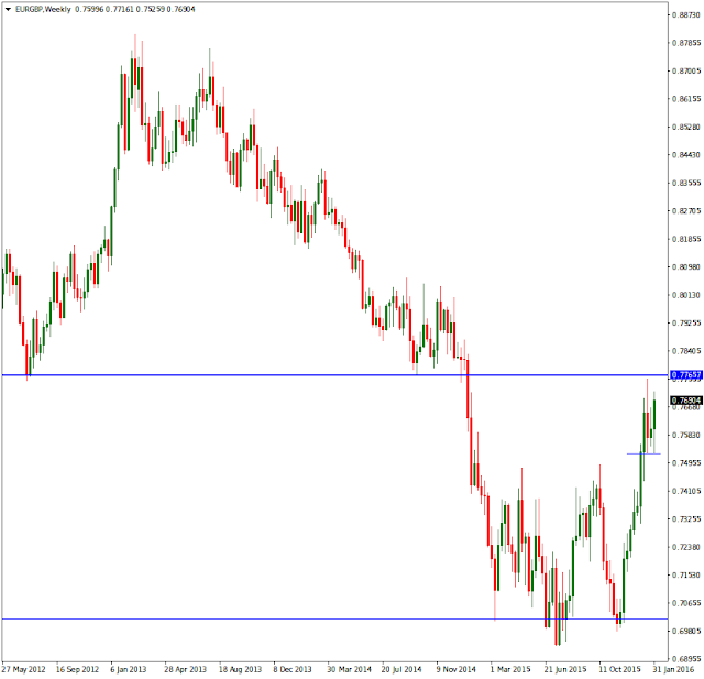
Daily
With yet more detail we can see that not only is price again into supply, with even more supply over head on higher time frames, it is important to know where buyers would come in if price were to fall and if their buying is enough to not only support price and prevent bears from pushing lower, but if there is enough interest from pro money to break supply in a significant enough way to show us they are bullish and in control. On this chart it is a waiting game with no immediate trade setting up. Unless you trade with crystal clear targets for entry and exits, you only give money to those who are more than willing to take it.
The lower angled blue lines show historic buying, more bullish orders will be hiding in those candles and as yet we dont know the quantum of the force behind them. Time will show us once we are patient.

4hr
This is one of my go to charts for trading, it is between long term and short time frames and has clear information most of the time. Over all we can see a range setup that is roughly 230 points wide, that is plenty for day trading and most of you here are day traders. We always look for what I call, room for profit. Unless there are clearly defined and obvious room in one direction and its in tune with higher time frames, then we consider the interest pro will have to be greater than if the room for profit was say 50 points. The point count has no formula or rule, it is a guide to help you make better decisions.
What else can we see, clearly price has been to the bottom of this range twice and on each occasion it moved away quickly indicating there was lots of buy orders waiting there. If price took longer to move away it would show that the interest from the bulls was lack luster.
At 'A' arrowed, we see the most recent significant supply where sellers came in with force and pushed the market hard down to the lower part of the range. We are now at the close back into this supply area and some more information comes our way, take of the move away from supply. We see a lot of buying came in on the 3rd last candle. Ask yourself, if there was so much selling before and price moved away rapidly, and now I see price move away, buy be bought into hard, does this mean new buyers appeared to push price higher?
At this moment the answer is no, what happened is price was prevented from falling and some support came in. This move will have taken out many day trader bears and got others long at the wrong time. The time is wrong because any trade taken there was right into the market close for the week and you do not want to hold forex over a weekend, and ideally not held even over night unless you can handle the games that happen by pro money.
If price were to fall from here there is a box below which is the only point that would interest me. Buyers remain there and with good conviction as indicated by the clean break and swift move up. This plays well into the bigger picture that looks bullish and it also gives me a large room for profit and likely outside of the top of the range. We know this because much of the over head supply has been taken out and those orders for the most part are gone.

1hr
For interests sake I will throw up a 1hr chart and show you what I am looking at. Where price is currently all it tells me is that the price action is terribly chaotic and lots of dumb folks trying to get price to break up or break lower. Logic suggests the best move is lower and back down near the box below. But, if you look at the arrow A, you will see some spiky moves that has taken bullish orders from the box. The candle A is where any sensible longs look most reasonable once we see pro money showing is the way. Any break up from where price is now is a fools game and best left to run until we break supply and find a good place for support to show up.
Ranges are fine to trade is they are wide enough and if there has been a good amount of time since the last tough of the extreme edges. There is nothing to say price has to respect the edges and always keep in mind that the time will come with either side of the range will fail and price will move away from there quickly, aiding in that move and all the stops that get taken out, break out traders who run after price, and new short orders that were waiting below, or in the case of a bullish break, long orders waiting above. I do not advocate break out or chasing trades, its a fools game.

15min
To drive the point home even more, does the blue line show you enough to say, buyers?....if they appear again it will be in or around the candles shown. Just be wary of the spiky nature of forex and that they can hurt stops if you are not careful and can go deeper into an range in order to get more orders filled.

Food for thought and I hope this is if benefit to you and help you tune your brain and eye to where orders lay.
I cannot take emails looking for comments on charts, it would be a full time job in itself. If some of you really want a private place to discuss trading, I will consider it, but only in a secure, private and considered method.
Be well,
Doc
The time is here once again to get more content online and while I know you all crave more information, I detest those who have been collecting my data and selling it without my permission. All content on this blog is exclusive my content and its copyright is protected. If I see more of this selling taking place this blog will end and will be replaced with a paid members only access solution and that comes at a cost to everyone including my time which is more valuable to me than any website.
There are no reproduction rights granted or inferred to anyone to use what is on this blog. Clear enough?...ok lets move on.
EUR/GBP monthly
Back to basics, this is our ten mile high view and from this we want to know what direction price has come from and where it is going to. What we can see is price has come from a high peak back in December of 2008 and has fallen with very deep pull back to the origin of the entire move.
The lowest thin blue line shows the upper range of the origin and the warning to you is, there is additional room below for price to fall if pro so desires. From this upper part of the range we also see price reacted bullish on two occasions with the most recent rise in price coming into the most near term recent supply as shown with the thick blue line. While it is not yet end of the current month and the last candle yet to close, all we can see is price is willing to push again upwards.

Weekly chart
Useful additional data shows up each time we drop down in a time frame. We see how price pinned the lower part of the supply over head and no major bearish follow through. The week ended with price ending up close to the high range of the weekly candle.
A little lower I have a thin blue line and this forms the lower range of a new price range that has setup. This range around 250 points and more than ample to become of interest for day trading if we see a fall. The thin line is a place where buyers appeared that were not there in big numbers when price fell to the left on the way down. Useful intel to be aware of.

Daily
With yet more detail we can see that not only is price again into supply, with even more supply over head on higher time frames, it is important to know where buyers would come in if price were to fall and if their buying is enough to not only support price and prevent bears from pushing lower, but if there is enough interest from pro money to break supply in a significant enough way to show us they are bullish and in control. On this chart it is a waiting game with no immediate trade setting up. Unless you trade with crystal clear targets for entry and exits, you only give money to those who are more than willing to take it.
The lower angled blue lines show historic buying, more bullish orders will be hiding in those candles and as yet we dont know the quantum of the force behind them. Time will show us once we are patient.

4hr
This is one of my go to charts for trading, it is between long term and short time frames and has clear information most of the time. Over all we can see a range setup that is roughly 230 points wide, that is plenty for day trading and most of you here are day traders. We always look for what I call, room for profit. Unless there are clearly defined and obvious room in one direction and its in tune with higher time frames, then we consider the interest pro will have to be greater than if the room for profit was say 50 points. The point count has no formula or rule, it is a guide to help you make better decisions.
What else can we see, clearly price has been to the bottom of this range twice and on each occasion it moved away quickly indicating there was lots of buy orders waiting there. If price took longer to move away it would show that the interest from the bulls was lack luster.
At 'A' arrowed, we see the most recent significant supply where sellers came in with force and pushed the market hard down to the lower part of the range. We are now at the close back into this supply area and some more information comes our way, take of the move away from supply. We see a lot of buying came in on the 3rd last candle. Ask yourself, if there was so much selling before and price moved away rapidly, and now I see price move away, buy be bought into hard, does this mean new buyers appeared to push price higher?
At this moment the answer is no, what happened is price was prevented from falling and some support came in. This move will have taken out many day trader bears and got others long at the wrong time. The time is wrong because any trade taken there was right into the market close for the week and you do not want to hold forex over a weekend, and ideally not held even over night unless you can handle the games that happen by pro money.
If price were to fall from here there is a box below which is the only point that would interest me. Buyers remain there and with good conviction as indicated by the clean break and swift move up. This plays well into the bigger picture that looks bullish and it also gives me a large room for profit and likely outside of the top of the range. We know this because much of the over head supply has been taken out and those orders for the most part are gone.

1hr
For interests sake I will throw up a 1hr chart and show you what I am looking at. Where price is currently all it tells me is that the price action is terribly chaotic and lots of dumb folks trying to get price to break up or break lower. Logic suggests the best move is lower and back down near the box below. But, if you look at the arrow A, you will see some spiky moves that has taken bullish orders from the box. The candle A is where any sensible longs look most reasonable once we see pro money showing is the way. Any break up from where price is now is a fools game and best left to run until we break supply and find a good place for support to show up.
Ranges are fine to trade is they are wide enough and if there has been a good amount of time since the last tough of the extreme edges. There is nothing to say price has to respect the edges and always keep in mind that the time will come with either side of the range will fail and price will move away from there quickly, aiding in that move and all the stops that get taken out, break out traders who run after price, and new short orders that were waiting below, or in the case of a bullish break, long orders waiting above. I do not advocate break out or chasing trades, its a fools game.

15min
To drive the point home even more, does the blue line show you enough to say, buyers?....if they appear again it will be in or around the candles shown. Just be wary of the spiky nature of forex and that they can hurt stops if you are not careful and can go deeper into an range in order to get more orders filled.

Food for thought and I hope this is if benefit to you and help you tune your brain and eye to where orders lay.
I cannot take emails looking for comments on charts, it would be a full time job in itself. If some of you really want a private place to discuss trading, I will consider it, but only in a secure, private and considered method.
Be well,
Doc
Thursday, 24 December 2015
Seasons Greetings
A much over due post and activity from me, so while I have some time I hope to get some posts up for you all over the next few days.
Best wishes to you and your families while you enjoy a deserved break.
Doc
Best wishes to you and your families while you enjoy a deserved break.
Doc
Sunday, 21 June 2015
EUR/JPY
Monthly chart.
First put obvious areas on the chart to show where price has been and where it is likely headed to for a target. Here we see a rapid and rather violent decline in price and as rapidly left supply, it approached demand in a sheepish manner. Note how price slowed down and wound itself into tighter falling ranges as demand loomed close. This happens on all times frames and while it is not the only approach used, it tells us a story. Here it meant the pro's were waiting for the time to reverse the market after a large drop in price, the best time to do it. Once the emotional card is played the herd will follow blindly.
The reversal came almost as swift as the decline and only human thinking causes this. Something will fall in price faster than it rises, humans are by nature negative when it comes to value.
From this chart we know that where price is now, its path is still bullish and the target has enough free space about the most recent supply to still be wide enough for profit to interest pro money.

Weekly chart.
At the bottom of the chart is the box showing demand and the obvious move up from that. The blue line shows us where price has in the very recent past found enough buyers to allow a clean and obvious place to move away from. The small box above that blue line is a decision point where price hesitated after it broke the small recent supply as well. This was a test to see will sellers come back into the market and this is also done on all time frames and all markets, it will be done in other places too to test for the strength of the opposing force. Its a smart way to get in at low cost, and get out at low cost if your wrong. Only pro money will do this because the herd and neither organised or have sufficient funds to keep a move going.
Above price is thin box showing the next batch of sell orders. There is nothing to hold us up if we wanted to take this long after we see some kind of support and continuation. 650 odd points is a good profit margin no matter what your account size once its traded sensibly. But before price goes up, it first has to come down and the same holds true for opposite trade.

Daily chart.
The most commonly viewed time frame in trading, its closing price is telling.
The only new item drawn on this chart is a blue line, it was not possible to see this level of detail on higher tinme frames and it gives us some more intel. It shows up price hit a tiny but significant enough supply area to stop price in its tracks and send it off into a range for a few days. We also see price made a second attempt to push through and once again at an even lower price than the blue was enough to send it back for the past two trading days.
Now the pro's are left with a situation where pushign hard from here could cost a lot of money and then will could try a exploit the weakness of the herd. They could sell short from here for a day or two, three etc.....and once price hits the lower box, buy into this and send it back up with enough very low cost long orders and build enough momentum to get through the blue line.
Given price is now in a range and the longer it stays in the range, the more spectacular the break will be. The bulls dont have the advantage here yet given there is still some supply over head and until thats broken they have a hard job. Another trick that would also work is a large spike through the rest of supply and close lower. That will clear out the last of the short orders and stop out the same orders once the pull back is deep enough. You can do great things in the market if you have the wallet for it.

4hr chart.
The last comment I made above is fleshed out a little here. If price cant push though the blue line then it can come back down the bottom of the range shown by the black line and see can it find more long orders to push higher, or better again is to break that line and get more folks short and bring it down as close as possible to the lower box. The herd will at this stage be fully commited short allowing enough time and orders to go long placed into that selling.
There is around 110 points between the line and the top of the box and that can be stretched into what will look like a very convincing few days of selling.

First put obvious areas on the chart to show where price has been and where it is likely headed to for a target. Here we see a rapid and rather violent decline in price and as rapidly left supply, it approached demand in a sheepish manner. Note how price slowed down and wound itself into tighter falling ranges as demand loomed close. This happens on all times frames and while it is not the only approach used, it tells us a story. Here it meant the pro's were waiting for the time to reverse the market after a large drop in price, the best time to do it. Once the emotional card is played the herd will follow blindly.
The reversal came almost as swift as the decline and only human thinking causes this. Something will fall in price faster than it rises, humans are by nature negative when it comes to value.
From this chart we know that where price is now, its path is still bullish and the target has enough free space about the most recent supply to still be wide enough for profit to interest pro money.

Weekly chart.
At the bottom of the chart is the box showing demand and the obvious move up from that. The blue line shows us where price has in the very recent past found enough buyers to allow a clean and obvious place to move away from. The small box above that blue line is a decision point where price hesitated after it broke the small recent supply as well. This was a test to see will sellers come back into the market and this is also done on all time frames and all markets, it will be done in other places too to test for the strength of the opposing force. Its a smart way to get in at low cost, and get out at low cost if your wrong. Only pro money will do this because the herd and neither organised or have sufficient funds to keep a move going.
Above price is thin box showing the next batch of sell orders. There is nothing to hold us up if we wanted to take this long after we see some kind of support and continuation. 650 odd points is a good profit margin no matter what your account size once its traded sensibly. But before price goes up, it first has to come down and the same holds true for opposite trade.

Daily chart.
The most commonly viewed time frame in trading, its closing price is telling.
The only new item drawn on this chart is a blue line, it was not possible to see this level of detail on higher tinme frames and it gives us some more intel. It shows up price hit a tiny but significant enough supply area to stop price in its tracks and send it off into a range for a few days. We also see price made a second attempt to push through and once again at an even lower price than the blue was enough to send it back for the past two trading days.
Now the pro's are left with a situation where pushign hard from here could cost a lot of money and then will could try a exploit the weakness of the herd. They could sell short from here for a day or two, three etc.....and once price hits the lower box, buy into this and send it back up with enough very low cost long orders and build enough momentum to get through the blue line.
Given price is now in a range and the longer it stays in the range, the more spectacular the break will be. The bulls dont have the advantage here yet given there is still some supply over head and until thats broken they have a hard job. Another trick that would also work is a large spike through the rest of supply and close lower. That will clear out the last of the short orders and stop out the same orders once the pull back is deep enough. You can do great things in the market if you have the wallet for it.

4hr chart.
The last comment I made above is fleshed out a little here. If price cant push though the blue line then it can come back down the bottom of the range shown by the black line and see can it find more long orders to push higher, or better again is to break that line and get more folks short and bring it down as close as possible to the lower box. The herd will at this stage be fully commited short allowing enough time and orders to go long placed into that selling.
There is around 110 points between the line and the top of the box and that can be stretched into what will look like a very convincing few days of selling.

US Dollar
Some heads up on the US Dollar. Here is the weekly chart on the USD index and something is starting to come undone. Note the run up, it looks as parabolic as many currencies did prior to the crash. Some of this move has been supported by policy where injections of cash into the economy has removed much of the incentive to short. Perhaps until now.
You can see clear change in pace by the bulls and no new highs made for some time, and also look at their last attempt to make a new high. It was sold inot strongly by bears who have been missing in the market for a long time and now start showing up. It is obvious that any further attempts by pro money to take this higher is going to result in a major bear/bull fight and will cost a pretty penny.
The last candle shows the week closed on a bear candle with some buying/profit taking into the close. Some retracement up from here for further short selling would be wise, the herd will need convincing this is not falling and get major media outlets to pimp it accordingly. The big picture is not one where I can see a buying opportunity for some time until prices reaches much lower prices.
Any potential short that setup have clear targets below. The lowest one is the origin of this move and any bounce there may well fizzle out because such a drop in price wont see many buyers coming in.

Daily chart.
A, no new high and immediate selling.
B, bears counter bullish buying immediately.
C, retest of the B move, success.
D, Broke what was historic buying.
E, to the left and down a little. even this buying has been broken.
Box on the very bottom is the last place for buying to come back in and as yet its too early to judge. But would you be a buyer when you look left on this time frame and higher?

4hr chart.
This is about as close as makes sense at the moment. C, on top shows how quickly the bulls got wiped out. There are lots of places where bulls could have reacted but all we see is bears fully in control.
The black line on the bottom shows near term demand resulted in a very small rally on the last trading day of the week. And even this has closed into its mini demand area with no concivtion or follow through to make a new high.

Tie all this intel with all the other currencies against the US Dollar and you will soon find out if major turns in the market are setting up. I get the feeling that the Greek deal will be the news that will hide any fact of the obvious happening and have something to blame it on, rather than it being normal market forces.
Order flow is not spoken about much in the media, its too boring and too obvious. Sensional news stories is what sells.
I dont post trades anymore, but here is just one to show that there are opportunities even when forex has yet setup with good trades. 32, S&P500 shorts and target just about there. Small time frame trades like that are littered on all charts.

You can see clear change in pace by the bulls and no new highs made for some time, and also look at their last attempt to make a new high. It was sold inot strongly by bears who have been missing in the market for a long time and now start showing up. It is obvious that any further attempts by pro money to take this higher is going to result in a major bear/bull fight and will cost a pretty penny.
The last candle shows the week closed on a bear candle with some buying/profit taking into the close. Some retracement up from here for further short selling would be wise, the herd will need convincing this is not falling and get major media outlets to pimp it accordingly. The big picture is not one where I can see a buying opportunity for some time until prices reaches much lower prices.
Any potential short that setup have clear targets below. The lowest one is the origin of this move and any bounce there may well fizzle out because such a drop in price wont see many buyers coming in.

Daily chart.
A, no new high and immediate selling.
B, bears counter bullish buying immediately.
C, retest of the B move, success.
D, Broke what was historic buying.
E, to the left and down a little. even this buying has been broken.
Box on the very bottom is the last place for buying to come back in and as yet its too early to judge. But would you be a buyer when you look left on this time frame and higher?

4hr chart.
This is about as close as makes sense at the moment. C, on top shows how quickly the bulls got wiped out. There are lots of places where bulls could have reacted but all we see is bears fully in control.
The black line on the bottom shows near term demand resulted in a very small rally on the last trading day of the week. And even this has closed into its mini demand area with no concivtion or follow through to make a new high.

Tie all this intel with all the other currencies against the US Dollar and you will soon find out if major turns in the market are setting up. I get the feeling that the Greek deal will be the news that will hide any fact of the obvious happening and have something to blame it on, rather than it being normal market forces.
Order flow is not spoken about much in the media, its too boring and too obvious. Sensional news stories is what sells.
I dont post trades anymore, but here is just one to show that there are opportunities even when forex has yet setup with good trades. 32, S&P500 shorts and target just about there. Small time frame trades like that are littered on all charts.

Subscribe to:
Posts (Atom)