Here is a break down on the eur/gbp on how it has reached a major swing low point and its bullish recovery in the near term.
First up is the monthly chart.
Price has fallen sharply and hit the blue line, which as you should know be now is where we last saw major buyer step in and break out from a long term range. The last candle has not yet closed, but given we only have a few trading days remaining in the month I do not see it pushing down much more than it has.

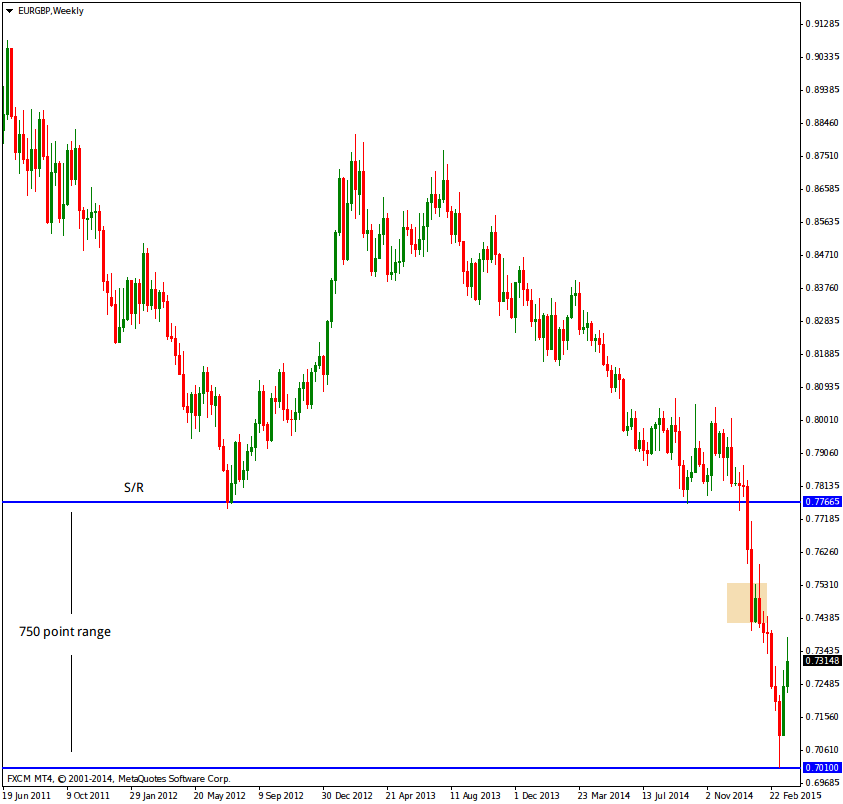
Weekly chart.
A little more information on this chart to help guide our eye and make sense of what we can see. The upper blue line is support and resistance and has been a reactionary area in the past and one we look for again in the future.
The lower blue line is taken from the monthly chart of where we saw buyers step in some time ago. Note the clean and rapid move away, a clean indication of lots of buy orders coming in at once. The range between the blue lines is 750 points and is appealing for pro money to work towards. Price will not go in a straight line between these areas and once a trade is managed correctly there will be multiple entries and exists all the way to the ultimate target.
One area to watch for as price rises is around the small box drawn. This could be a place where pro money take profit, allow price to drop back and load up again. But we shall wait and see and trade what we see and not what we think.
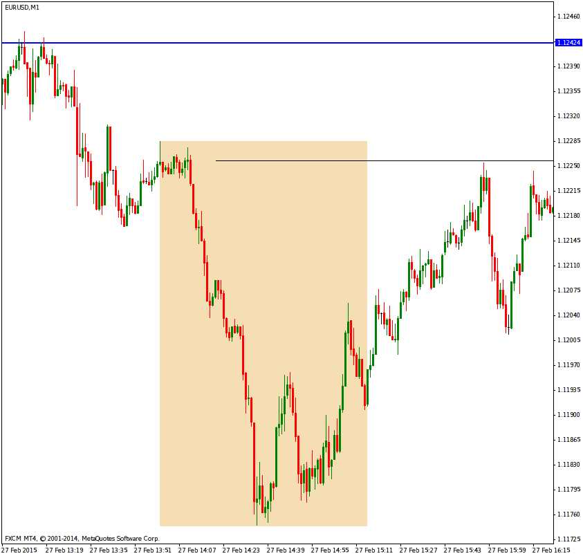
Daily chart.
We now get to see a lot more detail and the day traders actions. First thing to look at is how price pushed through the S/R line with relative ease, the market players are all still bearish and no buyers turning in to prevent price continue falling.
As price falls we see a retracement inside the box, the top of this box looks to be a useful place when price returns to that area. There has been clean price action on top and again as price pushed back up into it. But when price eventually left the box, note is slow meandering pace. Clearly there has been no major selling which is telling when you know price has been rapidly approaching major time frame demand.
Price hits the lower blue line which is monthly demand and there is no way I will stand against a monthly bull. You just simply will get wiped out if you try. Now that price has changed its track and its pace, you can see this in the candle stick price action where the upward momentum has over taken what was bearish momentum. There has been two deep pull backs and were useful as a means to test for selling. The current candle and the next red candle previous to this clearly shows how the test for sellers failed and the bulls ran with it. Pro money wont fight the market and instead will constantly test for opposing traders in areas where they know the probability of their entries costing more money than they wish to spend is great.

4hr chart.
This is a common time frame along with the daily for me to use as my guide and help gauge what is going on. Much of the market noise from the lower time frames doesnt show up here and its a cleaner time frame to look at.
First thing to note, it doesnt look like it at first glance, but the current move up has taken around half of the major 750 point range out already. The herd wont even have noticed this and the media wont pimp it until we are close to the upper portion of the range. No doubt spurred on by pro money to give a good news story which gets retail traders in a good mood and all will make money as price rise for a few days or a week or so, and then the pro money start the sell off and take their profits. I wont predict anything, but if the bullish move continues I will expect to see some nasty price action on the upper part of the range to allow long stops taken, new shorts placed and subsequent reversals to take their stops. It is the same age old techniques over and over again, yet the herd fall for this and have continued to fall for it over 100 years. You would think folks would learn to take what I call my ten mile high view before jumping in.
The two tests I mentioned in the previous chart are clearer here. I placed a set of black lines showing the test for sellers which also hits near term demand, deliberate?....you betcha. Think like a pro and get as many tasks done for the lowest possible risk and price as you can and once you see this happening in real time, the result should show their intent, which was take price higher here.
Last item to mention on this chart, look at the box, this represents a daily reversal of price. See how price fell, but the fall was not selling, but a test for sellers, into demand, price reverses and back into the recent origin. There is little value in looking beyond this because the market was closing and no reliable intel can be gained from the remaining few candles.

1hr chart.
I am placing this here only to show how the lower time frames appear to show you different information. What we know as a test for sellers appears to show a bearish trend coming back in. But the reply from the buyers at the lower blue line shows other wise and all of this is coming in at areas we would expect it, whereas a real selling trend would have broken the demand. Again, once the origin of that last move happened, we ignore the market close and wait for some new intel to show us what the next setup will be.

5min chart.
Now we are down to the main time frame just about all of you trade. The intel you get here can be highly useful if you pay attention to the higher time frames. As price reaches the areas we have identified before price has reached them, we drop down to this time frame and look for entries.
First up, this chart shows the daily reversal and how it looks on the 5min chart. We see supply on the left playing out which is a test for selling and on this time frame folks will say, but there is selling. If all you trade is the 5min chart in isolation, then yes it is selling, until you get stopped out at the bottom. Ok say you, I will let price hit the most recent supply and go short again, fine. But not the most recent supply was taken out and so was your stop, so this cannot be selling....again.
If you had the patience and knew something was not right about the supply being broken and watched for a while, you would see price come down very slowly off the most recent broken supply. If the selling was to continue it would not be as slow as this. Note where the slow price down ends up and finally takes off in strong bullish mode?.....into near term demand, and this was done before price reached recent supply because the intent from pro money was to use that chosen area as the place from which to send price higher for a low cost to them, but knowing the herd wont see it and will have orders to the contrary.
Supply when broken can become demand, just like resistance can. In this instance we see a real clever move that looks like it will be tried again.
You make have to think about this chart and its price action for some time, it says a lot more than I can given the time it takes me to get charts up here and emails out on occasion.

Ten mile view.
This is a zoomed out weekly chart. I have placed it here to let you see why has reacted in the way it did. Note the lowest blue line which I will also place in my next chart of the weekly, but zoomed in.

Weekly zoomed in.
My last comment was to take note of the lowest blue line and I will work from top left to lower right down to this line.
I tried to get some additional intel into this chart but cant fit it all on screen, and so the best I can say to you is that just prior to candle 1 was a push through of previous demand. We know now there was no interest in taking the last clean demand and the buyers did not show up. This means there is a change in sentiment from what would normally have happened. Ok, lets move to what the candle mean by number in the context of lack of interest from the buyers and clear signs from the broken demand of some selling showing up as wicks on the candles prior to 1.
1 pushed up into a previous bullish candle that closed more than 50% of its overall length and was taking short orders off what would have been demand, but below the demand price. You can refer to the other charts to see this.
2 Smart move by pro money, take out the high of 1 but close on its own lows. This was a false break and pulled in more low cost shorts, the herd got shafted again.
3 An inside bar, or to put it another way in logical speak. Activity that has done nothing to further price movement in any way outside of the previous bar. By bar I mean candle and its years of taking bars and not candles still has it come out, anytime you see me say bar, it means candle sticks given the chart type I favor.
4 Test for buyers into the low of 1. Some showed up but did not result is higher price and the bar closes on its lower half. It also closes lower than 2 and 3.
5 Pushes lower and closes toward its highs, but still remains an inside bar with respect to 1.
6 Opens and pushes higher in dramatic fashion, will have gotten the herd long, then reverses and closes on its lows and closes outside of 1. The range established by 1 and contained by 2 thru 5 has been broken. We know lots of failed bulls got stung and the bias is now bearish.
7 Opens at the low of 6 and pushes higher, but closes near its open. Result, no buyers of any significance.
8 Opens and pushes strongly down into monthly/weekly support and bounces off, but closes at the lowest price yet. The small wick shows no interest from buyers.
9 Looks insignificant but it pushes above the wick of the previous two candles and aided by the reaction off 8 as being bullish. We know this is no longer true and was another attempt at getting long orders in the market and reverse it yet again, which they did.
10 A strong push through monthly/weekly support and a clear sign the bulls have no hope left, not that they did for some time. This will have gotten many bears in the market and this cannot be allowed continue because it is not profitable long term for pro money. We close off the lows only by a small amount.
11 The counter punch, pro money take price higher to take out all the new short orders and given this went on for a week it will also have attracted a lot of new long orders who will have seen the previous week as a false break and reverse positions. Result, we close on the lows with the most powerful candle yet and close to the bottom of a historic pull back area which is way out of the chart to the left. Price slows as it reaches this.
12 Part of the pull back and the close nearer the highs is not buying.
13 Reaction of the market was the push above the highs of the previous candle as an aid to giving the illusion of a market turn, but closes at its lows and the herd get stung again. Sound familiar?
14 Break of the small range formed by the previous two candles and is pro money loading up for the final leg down.
15 Make it appear there is no interest in taking it short by closing well off the lows and a small real body with no reasonable distance of price falling. Easily over looked is the fact price has closed lower.
16 This is not surprising given there has not been any long term place on the chart to support buying and price has no option only fall again. The blue line it cut through and closed below was from an old reaction point way back. Given it managed to get through it and not have any reaction to it invalidates that point in the future. It had only one reaction before and we wont concern ourselves with it now.
17 The wick on top shows the market is being slowed prior to its touch down at major time frame demand. The danger in allowing the market fall too hard and too fast is that it would cost pro money a bundle to maintain the structure they see from historic order areas and greatly effect profits. There are trillions every day in these charts and you should be able to see that when major areas fail, it will cost some of the pro money players serious money and put others out of business. The wicks you see here are with an easy 100's of billions alone.
18 Touch down. A picture perfect hit to major time frame demand and just look at the tail and close. It doesnt show up any clearer than that and the structure has been held in tact and gives security to pro money that now they can start on the next market phase.
19 Big time reverse and close strongly not far from the highs. If I didnt mark the major time frame demand area the close of this candle would appear as a push up into near term supply and load up with more short orders.
20 The current candle and not yet closed. We are close to this months end and you can see supply has been hit and yet price still sits up there nice and high.

I could write volumes more on each candle, but as it stands it takes enough time to get posts up here and I hope the reasons you now see on longer time frames will influence how you judge the market on lower time frames.
What appears chaotic has order. Once you draw into your charts ahead of time these reactionary areas, you want to see pro money active around them. Then you wait for the test, which will come if you give it time. Most of you still need to learn a lot of patience and not run after price. Emotions will break your account and your mind if you let them. Be cold and calculating and wait for price to come to you where you have already decided that this is a place where I will take great interest and watch for it to react.